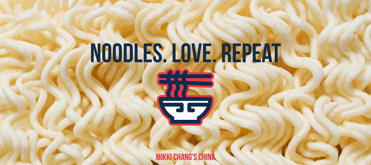
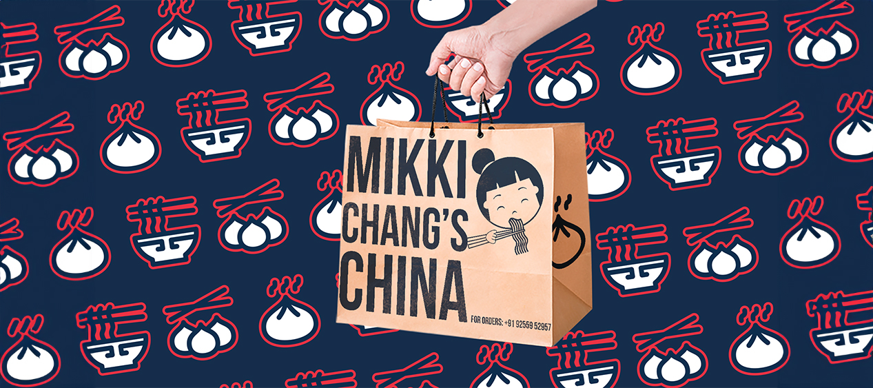
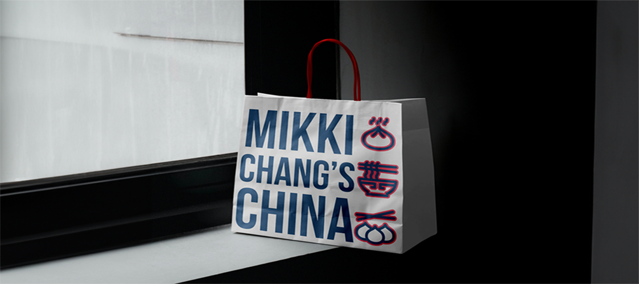
In our captivating brand identity project for Mikki Chang’s China, a Chinese food take-away brand, we’ve seamlessly woven oriental styles into every aspect. The bold color palette of blues and reds, alongside pristine white, pays homage to traditional Chinese aesthetics. Our mascot – Mikki, with her endearing expression as she eagerly slurps noodles, becomes an irresistible focal point, infusing the brand with a sense of liveliness and appetite appeal, effortlessly enticing customers to indulge in Mikki Chang’s China’s delectable offerings.
Our Work
Mikki Changs
Mikki Changs Chinese
Services
Brand Identity, Logo Design & Packaging Design
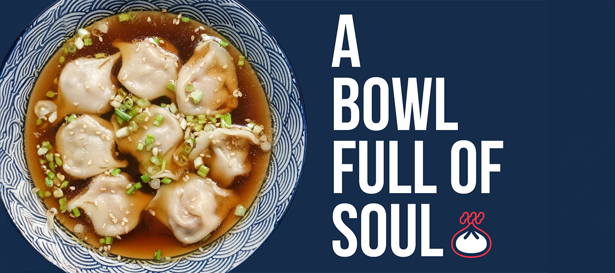
Silhouettes of a Chinese pagoda and sun further evoke the spirit of the Orient. The brand pattern, adorned with dim sums, baos, and noodle bowls, not only adds visual appeal but also celebrates the rich culinary heritage of China, promising customers an immersive and flavorful experience with every order.
This branding project for Mikki Chang’s China was an absolute joy, allowing our team to immerse ourselves in the vibrant and rich tapestry of Chinese culture while infusing every element with a playful and engaging spirit, making it an incredibly fun and rewarding endeavor.